R - Some more research
So I am going to look at some vector based designs, and I am going to research for some logo designs.
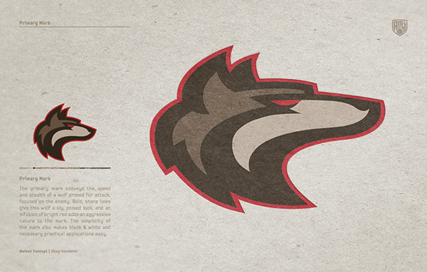
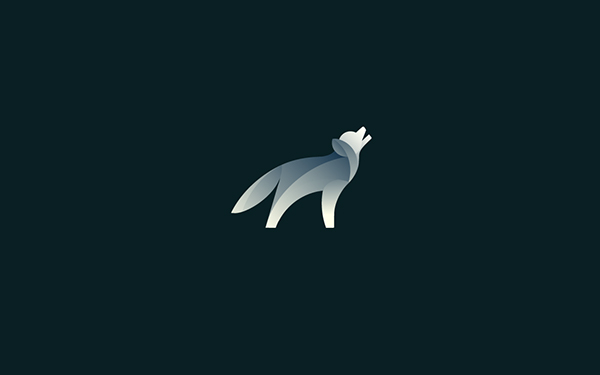
Here is the Michigan Wolves logo, I think that this is a great vector wolf, I love the way that the wolf isn't too aggressive but you can make out it is a wolf. I also like the contrast between the colours, I think it makes the logo stand out. Also the boldness of the strokes and outline makes this logo effective, I think that something like this could make a great logo for what I want.
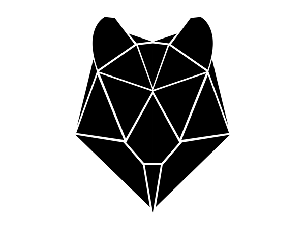
I really like this design, I think that not only is it effective but I think it stands out and looks great, I love the way that the wolf is black and there is only white lines to make up the parts of the head. I think that not only would this look great on a white background but I think it would look great on all bright colours, especially if the white was changed the colour of the background. Overall I think that this is very effective and I think the minimalist look is something I am looking for.
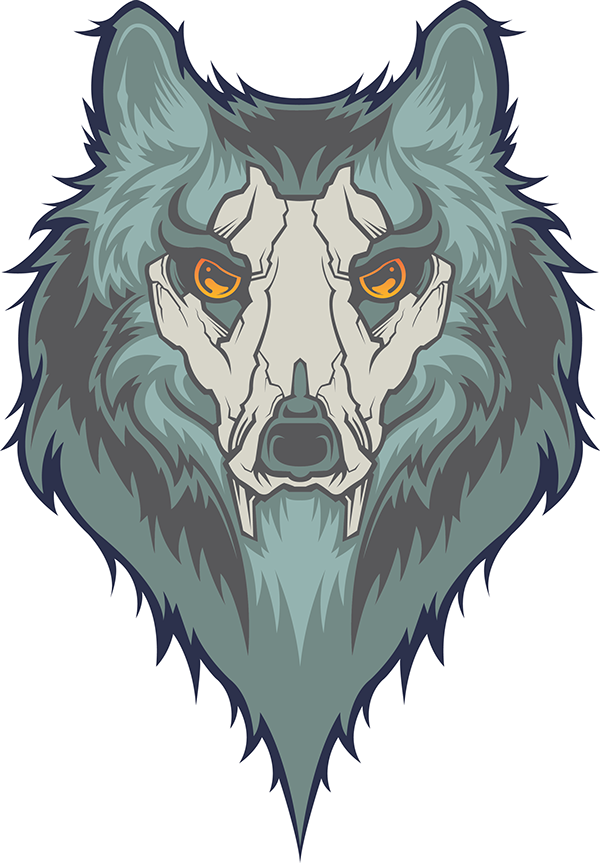
I really like this design, it isn't a complete wolf, it has a mask of sort on it, but I really like the positioning and the design of it. I think that everything stands out on it and I also like the contrast between the different shades of blue. Also I never really thought of adding something to the wolf, I think that the mask makes it look a bit more fierce and that it looks more surreal.

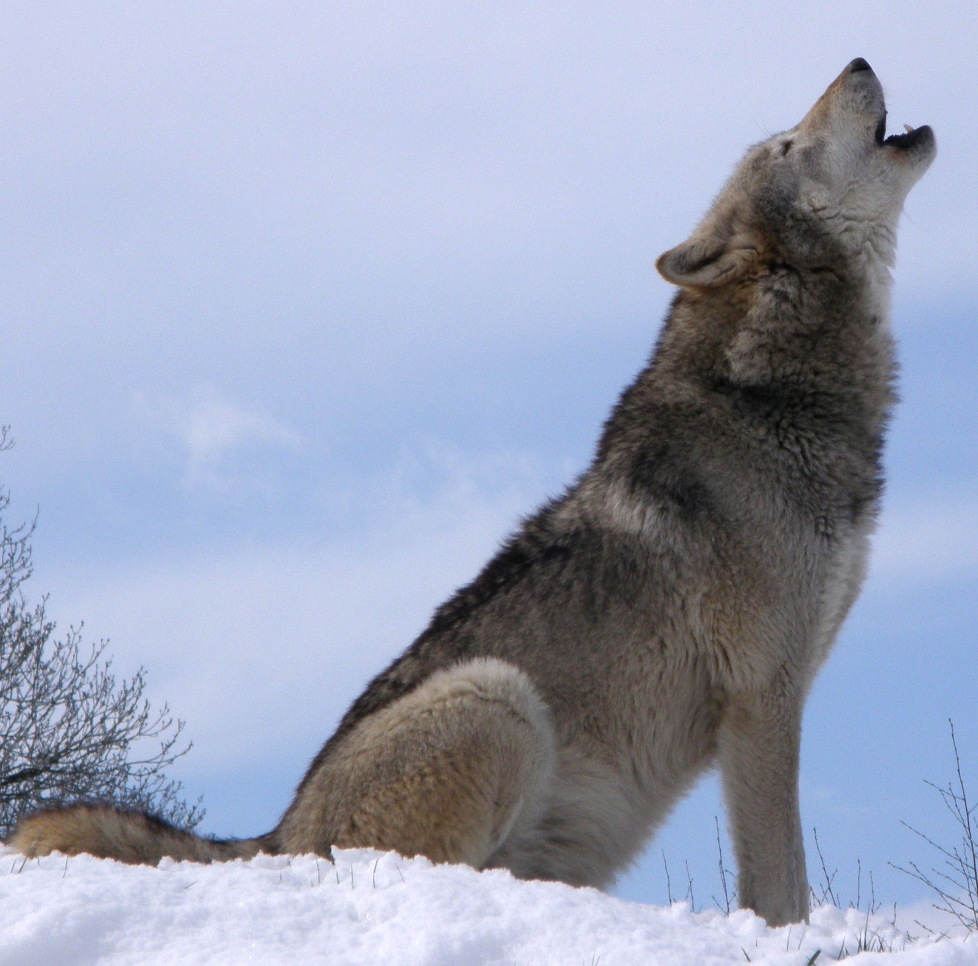
This wolf is a great example of what I wish I could do, but I think I want something a little more minimal, I think that this would be great on the business cards and other corporate identity, But I think for my purpose it is a little too detailed. However I really like the contrast and also the expression on the wolf's face. This makes it look really fierce with its teeth out.
Here I found just a vector image, I think that the simplicity is amazing, however I don't think it is the sort of thing I am looking for. But I will consider this sort of thing when I am doing my sketches, just to see whether it will look effective alongside my type. I also think that this is a great combination of shapes, I love the way taht everything is curved and there aren't really any straight edges.
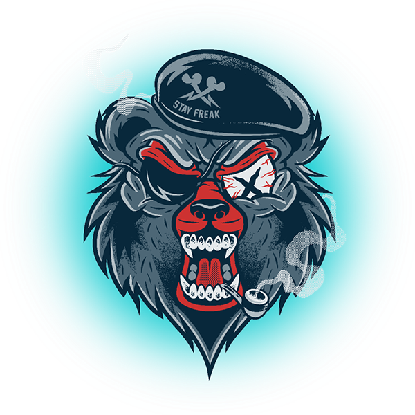
I really like this design, I love the way they have changed a wolf and added extra's onto him. I think that I could maybe do this, I also think the extra's make the wolf look more fierce. This is a great idea for me, I think that having something like this would make my Crossfit Identity much more different and...qwerky?
I know that this isn't a complete piece of work, But I really like the design, I think that the straight edges give the wolf that sort of mechanical feel to it. I think that this is the sort of thing I will end up doing, however I would like mine to have its mouth open and to look more fierce. But overall I think that this is a great piece of design.
posted by Unknown @ 12:26
0 Comments
![]()